Monday, 26 October 2015

Public Art in Plymouth


I'm supposed to critique some public art in Plymouth as part of my Context of Practice course, so here goes.

First off, I should declare an interest in some projects, notably ones where I was the artist..

..and competitions for public works of art where I submitted ideas and didn't win (and thus have an axe to grind). There have been quite a few but one in particular stands out - a project on the Hoe "celebrating" Stanley Gibbons, that was the subject of a bit of a rant in a previous post.

So:

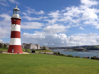
Smeaton's Tower on the Hoe


Saying this is public art is probably controversial (which is why I picked it).   I would say that it's by far the greatest work of public art in Plymouth because:
  • It's come to symbolise the city in the same way, for instance, that Antony Gormley's Angel of the North has come to symbolise north-east England 
  • It reflects Plymouth's maritime history - that it was the port from which people set out to explore (and conquer) the world.
  • It's a fitting centrepiece for the Hoe, which is in itself a very special place.
  • It's big! 
Plymouth City Council often floats ideas for further public works of art on the Hoe.  I think it should be careful where it sites them - avoid cluttering up the place with second rate stuff (or worse - see my Stanley Gibbons rant).

Sculpture outside the Cornwall Street entrance of Drake Circus


  • I quite like the pillar and the way the polished surfaces reflect the surroundings but I don't like the figure on the top. 
  •  I don't know what it means, what it's trying to tell me.    I've done a small amount of Googling to try and get a better understanding of it.  Apparently it's supposed to be a diver.  I don't get the significance of this;  I don't think it's a reference to Plymouth's famous diver, Tom Daley, because it's a female figure.  I think it looks a little ungainly.
  • It's surprisingly easy to walk by the sculpture without even noticing it.   I think more thought should have gone into making it more striking, and more relevant to its setting.

The Plymouth Sea Monster or "Barbican Prawn" 


It's about 10 metres tall and is on the West Pier of Sutton Harbour, on the route to the Aquarium.  It was erected in 1996 and is supposed to represent the fish and shellfish landed on the Barbican.  The artist is  Brian Fell (I really like his Merchant Seaman's Memorial).  

I think it's okay.  It's relevant to its surroundings and I think the design and choice of material are good - I like the patination of the copper.  I like the structure that it's sitting on, which reminds me of a church steeple more than the mast of a ship.  It's high enough for it make the Prawn highly visible as well as vandal-proof.
Friday, 23 October 2015

Geoffrey Mann


Artist Geoffrey Mann gave a talk at Plymouth College of Art on Wednesday evening and followed it up with tutorials with students, one of them being me.

I really like Geoff's work, which uses digital technologies to translate intangible phenomena (right word?) into visual forms.  Here's two examples :

Time into Shapes

One example he gave in his talk was tracking the flight of a moth - see the photo below.


I think this particular work is in 3D printed nylon, which gives it a similar texture to a moth's wing.

In order to create this, he put a couple of special "dots" on the wings of a moth and let it fly around a confined space, tracking its movement with multiple cameras.  He then processed that info to create this ribbon which if cut at any place reveals the outline of the moth at that particular moment.

In my tutorial, I asked him how he learned that this was possible, and how he learned how to do it.   The dot idea is used all the time in film animation, apparently, and Geoff has developed a network of people in this sort of area that can help him.

Geoff has repeated this idea with a pigeon and translated the 3D prints into other materials - notably some really large scale glass and bronzes pieces.   I suppose he smooths the 3D print and makes a mould from it to do this.

Geoff told me that he's never had a failure with his glass projects, which I find truly remarkable - bearing in mind how often I have chipped casts while cold working.  He says he does all his cold working in the evenings when he's not distracted and there's less risk of contamination.  He also uses acid on occasions.

Noise into Shapes

Parts of another of Geoff's projects, called Crossfire, are on display in the Echo exhibition in the College gallery at moment.

In this case, Geoff turns noise into shapes.   He started off by blowing on a cup of hot tea and noting the waves it produced.  Then he got the idea of converting "directional" noise into waves that distorted objects in their path.

The foundation of Crossfire is this video of an argument over a dinner table.

Here's an example of the result - a china teapot with a sound-wave traveling through it:


 The teapot on display in the College gallery was made in a conventional way, copied from a larger 3D printed pot derived from Geoff messing about with sound and video.  The same is true of the wine glass on display - it was made by lamp work, copied from a 3D print.   Geoff says the 3D prints themselves didn't have the flowing, organic feel to them that he wanted.


Wednesday, 21 October 2015

Clever Clocks

I went to the Rijksmuseum in Amsterdam on Monday and was really tickled by this exhibit:


It's called "Grandfather Clock", part of the "Real Time" series by Maarten Baas.

Initially, it just looks like a Grandfather Clock but then you see a partially obscured figure inside the clock rub out the hands showing the time and draw in new ones. People near me were wondering whether someone was inside it, although it's clearly a film projected onto the clock dial.

Here's a video of it:


I love it!  So clever!

Here's an essay on why the Grandfather Clock is exhibited in a hallway rather than one of the galleries.   It demonstrates how people react to art differently when it's not located in an expected place, even within a gallery.

Maarten Baas's "Real Time" series also includes:

A digital version of the same thing:


And "Sweepers' Clock" -  two people sweeping lines of garbage so they form the hands of a clock:


 UPDATE on 23rd October

Another clever clock, featured in today's Dezeen:

In this case, if you point your finger at the centre of the clock, shadows are cast giving the correct time.  Watch this video.

And last (for now) but not least, check out this wall clock, posted on YouTube by Aristidis Boustras:


Saturday, 17 October 2015

Georges Perec and the "Infra-ordinary"


My Context of Practice course has resumed - I had a year off because I'm a part-timer.

Our first lecture featured Georges Perec, a French philosoper, film-maker and author of some "post-modern" books which sound, erm, interesting.

For example, one of his books, La disparition, avoids using the letter "e".

Perec describes another of his books, La Vie mode d'emploi,  as "novels" plural.  It describes the rooms and stairwells of a fictitious Parisian apartment block and tells stories of its inhabitants.  In the end, it's revealed that all of the action occurs at a single moment in time.

More on Perec's background in his Wikipedia listing here.

Anyhow, Perec created a "collection" of his writings entitled "L'infra-ordinaire" that points out that we don't notice a lot of the stuff we encounter every day.  And this was the focus of a lot of the lecture.

Personally, I don't see this as much of a revelation.  Our brains make sense of the welter of stimuli hitting our senses by screening out the expected and focusing on the unexpected - the stuff that stands out from the noise.

I tried to make this point by suggesting that autistic people have problems doing this and can get overwhelmed with "irrelevant" stimuli.  Think I should have kept quiet!

Part of our homework is to find some detritus, draw it and annotate it with text from Perec's writing or do the reverse - find a text in Perec's writing and find an object that "completes the narrative" (whatever that means).

I think the text we're meant to focus on is in "Species of Spaces and Other Pieces" which Perec wrote in 1973 .  A translation by John Sturrock is on sale as a Penguin Classic.

An extract of this was published on a website called Day-to-Day Data, so I'll go with this, and I'll pluck out "Question your tea spoons" as my starting point, because I've got a bit of a fetish about tea spoons.

Here's a selection from our kitchen drawer -  I'll number the 9 spoons from the left.


  • I always use 1 for making drinks and eating stuff like ice-cream.  I appreciate their design and quality.  I like the way they look and feel.
  • I always use 2 for eating muesli.  It's a bit bigger than 1 and the design is okay.
  • I always use 9 for eating avocados, for practical reasons (the pointy-ness).
  • I won't use 3 and 4 under any circumstances.  I really dislike the look and feel of their round handles - so much so that I won't let them share the same compartment as the 1s;  if I discover one lurking there, I move it.
  • 5 and 7 were our regular spoons before we went up-market with 1s - I no longer use them.
  • 6 must be a grand-child's spoon.  It could have been left here for future use, or my wife might have bought it.  Something is plucking at my heart strings.
  • I think 8 is a spoon we inherited.  Old fashioned looking.  I would never use it.
So, questions for those teaspoons:
  • 1, do you feel the same about me as I do about you?
  • 3 and 4, do you hate me as much as I hate you?
  • 2, are you fed up with muesli all the time?
  • 6, what's the story behind you being in our drawer?
  • 3 and 4, do you long for the days when you were my regular teaspoon?  


Monday, 12 October 2015