Thursday 31 December 2015

Recommended Reading


I am having real trouble dealing with recommended reading in the Context of Practice course I'm doing.

 I've ended up buying 5 books and all of them are written in a "scholarly" style that really gets on my goat.

By "scholarly" I mean that the books are packed with references to other studies so I come away with the impression that I'm dipping into ivory tower stuff - a bunch of academics more interested in each other's work rather than helping an outsider like me understand what they're going on about.

In fact, I get the impression that these folk deliberately set out to make their musings hard to understand by the likes of me by using:
  • Long-winded ways of explaining things 
  • Very long sentences
  • Words that I have to look up in a dictionary (if I can be bothered)
I find it very difficult to maintain my concentration.  I drift off and eventually realise that I've "read" several pages without taking in any of it.

It's not as though I struggle with reading and writing.  I was a journalist and editor for 30-odd years and followed rules like these:
  • Get to the point
  • Be concise
  • Use simple words
  • Make it easy to understand
In other words, the exact opposite!

The Books

So here are the 5 books I've been struggling with:

(1)  "Designing Things: A Critical Introduction to the Culture of Objects" by Prasad Boradkar.  
I got to page 65 and seized up.

(2) "Design Studies: A Reader" by Hazel Clark and David Brody
I started reading the introduction of this one, then leafed through it thinking "mmmmm"

The above were recommended by Sally Hall, our temporary lecturer.  She seemed quite down to earth  so I was hoping the books would be, too.

The following ones are "suggested reading" in our assignment brief:

(3) "Thinking Through Craft" by Glenn Adamson
I got to page 10 and seized up

(4) "Scale" by Andrew Herod
I asked for this as a Christmas present.  The people that gave it to me were impressed - said they couldn't understand it.  Maybe I could if I dedicated a lot of time to it but I can't be arsed.

(5) "The Craft Reader" edited by Glenn Adamson
Another Christmas present.  It looks a little less intimidating but it's 630 pages long.

The Crunch

Here's what bothers me about these books:
  • I think it's unrealistic to expect contemporary craft students to read and understand these books.  They're written by academics for academics - not for people whose focus is on making works of art.  
  • Reading these books would take a lot of time and effort and what would I gain from it?  Maybe I could pass myself off as an intellectual but I'd prefer to spend my time reading books that were more directly relevant to what I'm doing at college.  I am reading (and enjoying) a number of books in this category and will write about them in due course.
  • Most worrying of all, my current assignment in Contemporary Craft calls for me to research and write an essay of 2,500 to 3,000 words.  I don't have a problem with that, but I'm pretty sure that I'll be expected to emulate the "scholarly" style in these books.  That will REALLY irk me!

Update 8th January 2015

Our lecturer acknowledged that our recommended books were above our level, more suitable for PhD types and recommended the following as easier reads:

“Making is Connecting: The Social Meaning of Creativity, from DIY and Knitting to YouTube and Web 2.0” by David Gauntlett

“Stuff” by Daniel Miller (BTW, I’ve read and really enjoyed “Stuff Matters” by Mark Miodownik) 

“Beautiful Thing: An Introduction to Design” by Robert Clay 

“Hertzian Tales: Electronic Producs, Aesthetic Experience, and Critical Design” by Anthony Dunne (who collaborates with Fiona Raby – see http://www.dunneandraby.co.uk

“Makers: The New Industrial Revolution” by Chris Anderson 

“Emotionally Durable Design: Objects, Experiences and Empathy” by Jonathan Chapman.  See also this item from BBC's Today programme: 


Wednesday 9 December 2015

Manifesto Part 2


This follows on from my previous post, which gives the context.

Here's my planned presentation:

5 slides, a maximum of 5 minutes, 7 points


Point 1:  I'm not just a designer/maker.  I think my imagination, my ability to dream up ideas and think laterally is my biggest asset.  I'm an innovator/designer/maker

Point 2: I have an unusual combination of creative and engineering skills.  This has a strong influence on WHAT I choose to design and make and HOW I go about it.  This slide shows one of the results - a project I'm working on now.


Point 3: I don't want to specialise in a single material.  This slide shows another project I'm working on -  making teapots out of unusual materials.  I've shown  wax, paper mache, plywood, cocktail sticks but I also plan ones in chocolate, lead, tea and, well,  you name it, I'll try it!


Point 4:  I want to play to the gallery.  I want my art to be accessible.


Point 5:  I want my art to intrigue and amuse people.  I made this earlier this year.  It's the ghosts of deformed carrots, eaten by slugs in my garden.  The carrots are no more but the space they once occupied is preserved for future study in these cast glass specimen jars. 


Point 6:  I want fame rather than fortune

Point 7:  The top of the plaque says "English Heretic" rather than "English Heritage".  I'm a heretic - a non-believer - in various things.  For instance, I'm sceptical about a lot of art theory and think  some modern art is a case of "emperor's new clothes". 

Saturday 5 December 2015

Escher, Calder, Ai Weiwei, etc


I've spent the last few days in London where I visited various art exhibitions, among other things.  Here's my thoughts:

The Amazing World of M.C.Escher at the Dulwich Picture Gallery. 

I've listed this first because I liked it the best.  I love everything about Escher - including the fact that he is sometimes viewed with snobbishness by the art elite, some of whom (apparently) consider him merely a highly accomplished graphical technician.

I love the way he's so meticulous, the way he doesn't fit into any of the art genres, the way his work appeals to the masses, the way it intrigues and amuses the viewer.


Here's some links:

"Official" M.C. Escher website

"Performing Sculpture" by Alexander Calder at the Tate Modern

Calder pioneered the use of wire to create sculptures that are almost like 3D line drawings.  


He's probably even more famous for his mobiles, also often made with wire.


I love his stuff.  I keep on meaning to give mobiles a go myself.

I was a bit annoyed with the Tate over this exhibition.  It charges quite a lot for entry (I paid £14.50 for an OAP ticket without a donation).  Then it charges quite a bit extra for an audio guide (I decided it wasn't worth it.)  Then when I got inside, I was stopped from taking a photo!

Ai Weiwei at the Royal Academy

I liked the way I was allowed to take photos in this gallery.  But what do I think of Ai Weiwei's work?

A lot of his exhibits are (a) protests about the Chinese government and (b) recycled material of various sorts - from straightened reinforcing bars from buildings that collapsed in an earthquake to recycled antiques ranging from furniture to parts of ancient temples that have been demolished to make way for urban development.

There were quite a few references that struck chords with what I'm doing on my "Teapotty" project  .  For instance, he recycles antique tables so 2 legs are on the floor and 2 are on the wall, or there are some other modifications that undermine its assumed function - much the same as my choice of unexpected materials renders my teapots unusable.

Similarly, the surface of some of Ai Weiwei's work is intriguing:


This is a ton of tea, compressed into a 1-metre cube

Novelty Automation

This is an arcade of home-made coin-operated machines built by enthusiasts.  I took a video of one such machine, in which Nicholas Serota, director of the Tate museums and galleries, makes judgements on whether submissions should count as art:


"Power Stations" by John Hoyland at Damien Hirst's Newport Street Gallery

This is last and least, in my view.  I had an hour or two to spare so I thought I'd see what Damien Hirst's new(ish) galley was like.  It's quite out of the way and when I was there it was very quiet - maybe a dozen visitors total.

I just don't "get" John Hoyland's work - large canvasses with rectangles of different colour paint on them.  They are strong colours.

Some links:


A more positive Time-Out article


Thursday 26 November 2015

Objectified


Another assignment for my Context of Practice course:

Watch "Objectified", a documentary in which a lot of leading designers talk about their work, and make some observations about it in the next session, scheduled for 3rd December.

I've just viewed it and as I won't be attending the 3rd December session, I'll make a few observations here.

Apparently, Objectified is the second of a trilogy of documentaries.  The first one was about the Helvetica typeface and the third is called "Urbanized" and looks at the growth of urban areas.

Regarding Objectified:

Here's a list of "Top 12 Quotes" from the video in a blog written by Build LLC, a Seattle-based firm of architects. 

The ones that struck me:

"Every object tells a story if you know how to read it,"  a famous quote by Henry Ford (cited by Andrew Blauvelt, design curator of the Walker Art Centre in the video).

It brings me back to a question I've asked myself before - should I try and make my work tell a story of my own making, or should I let my audience make up their own stories?

My experience suggests the latter.  For example:

  • The person that selected my "Ghosts" for an exhibition told me she'd picked it because of its references to the threat to global bio-diversity, a connection I'm still struggling to comprehend!
  • I only realised that I'd designed "Smitten" in the style of Beryl Cook when someone pointed it out to me, after I'd submitted the proposal.

"We now have a new generation of products where the form bears absolutely no relation to the function" - Alice Hawthorn, design editor of the International Herald Tribune.

I wonder whether this only applies to consumer electronics?

Actually, I think it all depends on what you're looking at in consumer electronics   - a point made by Bill Moggridge, the designer of the Grid Compass Computer, also cited in the video.  Namely, the design of consumer electronics doesn't stop at the surface, the hardware - it goes much deeper, into the software.

The reason that Apple's stuff is so successful isn't just because the outside surface looks minimalist and beautiful; it's also because the software is so well designed and intimately integrated with the hardware (which was probably top of Steve Job's manifesto).

I would say that form may not follow function visually in Apple products, but it does follow it from an "experience" point of view.

Thinking about it some more, I think there are other examples of form no longer following function.  There was a time when you could see the various components of a car engine, for instance - the spark plugs, the distributor, the carburettor,  and each one gave clues about what it was for and how it worked.  Nowadays, the whole engine just looks like a box;  the opportunity to fix things yourself has largely been with-held.

I like one of the final points that was made - that the means of making stuff is likely to shift into people's homes (or maybe the equivalent of libraries) in the future.  

I take this to mean that this will have a strong influence on design, and probably make designers more important in the future.


Vision for the Pillars

I've finally caught up with the results of another competition that I entered early this year in collaboration with Noah Taylor and Mim Brigham.

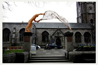
It was for an "an iconic work of art" to "adorn" the existing pillars between the main church of Plymouth, St. Andrew's, and Royal Parade. The budget was £20,000 and the deadline for submissions was the end of January 2015.

The brief asked artists to take note of St. Andrew being a fisherman, the presence of the Christian faith at St. Andrew's for more than 1,000 years, the "Resurgam" (I will rise again) sign that symbolises the church's restoration after World War II, and the special relationship between the church and city.

An article in the Plymouth Herald in May of this year named the winner as Rodney Munday with the proposal in the photos below:


Here's a link to Munday's website.   

I like the concept of his winning design; St. Andrew casting his net.  Personally, I would have preferred a more stylised implementation.

Earlier this year I wrote a booklet listing some of my efforts to win public art commissions  as part of a "Public Realm" assignment at College.  (If you'd like a PDF of it please get in touch.) 

Here's a copy of what I included about this project:

I never felt comfortable with this project. I thought the £20,000 would be better spent on landscaping around the pillars.

To cut a long story short, another student, Mim Brigham, suggested a joint project and this morphed into re-instating the railings either side of the pillars, as stainless steel screens of sea-weed with fish weaving their way through it, towards the pillars.

We then invited Noah Taylor, a metalwork specialist and resource manager at PCA, to join us and he suggested sweeping the screens up to the pillars and topping them with cast glass columns, drawing the eye towards the pillars and then upwards to heaven. The cast glass columns would be lit and would incorporate the word "Resurgam" as a negative space in their walls.

Although it was relatively simple to draw the sea-weed and fish screens in 2D, it was tough to visualise what they would look like when placed on top of the existing walls. Eventually, I made a scale model and used photographs of it in our joint submission.


 Three of the 50-plus submissions for the project were shortlisted. Ours wasn't one of them.
Lessons

1) This was the first time I've worked with others to submit a joint proposal, and I found it very useful. Mim Brigham got the fish and sea-weed idea started by showing me a photo of some nice wrought iron work in a French cathedral. Noah Taylor proposed a way of bringing the attention back on to the pillars, and to the heavens, with his glass columns.

2) Making a model was a good idea, particularly as our project was hard to visualise in 2D. The model was relatively quick and inexpensive to make and was useful for trying out ideas as well as photographing for use in the submission.

3) It might have been sensible to abandon this project at the outset. "Adorning" the pillars just didn't seem like a good idea to me and I wasn't surprised about our rejection. On the other hand, I enjoy the whole process of entering these competitions and I learn from them even when I'm not successful.


Sunday 22 November 2015

Design Manifesto


This is a project on my Context of Practice course at Plymouth College of Art.    The brief says:
"You are asked to identify and define your own personal manifesto as a designer/maker and to articulate this through a poster/advert and a short interactive digital presentation. 
The project is intended to explore and externalise who you are as a designer/maker. what methods and principles you employ within your work, and most importantly what issues concern you within the context of your own practice."
So here goes on a manifesto

Who I am 

  • I'm not JUST a designer/maker.  I think my imagination, my ability to come up with novel ideas, is my strongest asset.  I'm an innovator/designer/maker!
  • I have an unusual combination of creative and engineering skills.  This sometimes steers my choice of projects.  It also means that I put a lot of thought into the way I make things.
  • I want to work in all materials.  I don't want to specialise
  • I like taking on challenging projects, preferably large scale ones

Issues

  • I want my work to amuse and intrigue everyone, not just people that already have an interest in art.
  • Although I'm doing a course in contemporary craft, I want to make art

Here's my first draft of a poster/advert:


My feeling is that the poster/advert needs to be simple so I've just focused on 2 messages - the text one saying I'm an innovator and the visual one, that I combine art and engineering.  

Do you think it works?

Here's an April 2015 article by  Harriet Baker called "10 game-changing art manifestos" on the Royal Academy website.  It ends with a Grayson Perry contribution, or rather his contribution on behalf of "Red Alan", a ceramic sculpture of Alan Measles, his teddy bear:


Friday 13 November 2015

Teapots


I've started a parallel blog, solely focused on teapots, as my research project for the current Context of Practice course.

Here's a link to it: Peter's Teapots

Monday 9 November 2015

Maths and Art

Another example of how maths can underpin art!

In this case, it's Dail Behennah, who gave a really good talk at Plymouth College of Art on 4th November.

Up until recently a lot of Dail's work has been 3D grids of willow sticks following some quite complicated geometries.   In her talk she called them "op art".   Here's an example:


"White Square" 41x 41 x 9cm white willow, silver plated pins

"My work is about line, light and shadow," says Dail's statement on her website.

 "I always try to bring to it a sense of calm, but not stillness," she adds.  I think she achieves this by rigorously following geometric patterns with a very high degree of precision.

It's also achieved by making the fastenings (silver plated pins in the above photo) a feature of her pieces, so, as she puts it, "the method of construction is open and honest." I like it!

One of the things that intrigued me with some of Dail's 3D grids is that they have inflexion points - positions where the view of them suddenly shifts as one plane comes into view and another one "hides itself" in the grid.

Dail designs her grids by hand so it must be almost impossible to visualise where these inflexion points might occur until she's made the piece.

This reminds me of something I made more than 40 years ago - block wave, a series of little wooden cubes cut so they create a row of twisted columns.  I drew attention to the twisting by painting the sides of the columns in different colours.  What I didn't realise until I'd made it was that it also created diagonal waves in each colour, across the work.

I've toyed with recreating this in glass, and Dail and I have exchanged a couple of emails about this idea (and other stuff).  She thinks the refraction of the glass could create some really interesting effects.  I think I'll take this forward when I've got time.

Back to maths and art.  In one of her emails, Dail says her maths "is instinctive not formal", which reminds me of M.C. Escher and his collaboration with Professor Sir Roger Penrose, an eminent mathematician.

Escher thought he had no mathematical ability but was able to express highly complex mathematical concepts in his woodcuts and lithographs according to a September 2015 programme on BBC TV.

UPDATE 16/Nov/2015:  I've now launched a project to make a glass version of block wave - here's a link to a page on my website about it.

Monday 26 October 2015

Public Art in Plymouth


I'm supposed to critique some public art in Plymouth as part of my Context of Practice course, so here goes.

First off, I should declare an interest in some projects, notably ones where I was the artist..

..and competitions for public works of art where I submitted ideas and didn't win (and thus have an axe to grind). There have been quite a few but one in particular stands out - a project on the Hoe "celebrating" Stanley Gibbons, that was the subject of a bit of a rant in a previous post.

So:

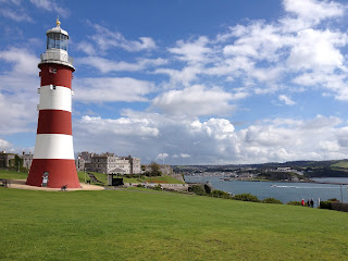
Smeaton's Tower on the Hoe


Saying this is public art is probably controversial (which is why I picked it).   I would say that it's by far the greatest work of public art in Plymouth because:
  • It's come to symbolise the city in the same way, for instance, that Antony Gormley's Angel of the North has come to symbolise north-east England 
  • It reflects Plymouth's maritime history - that it was the port from which people set out to explore (and conquer) the world.
  • It's a fitting centrepiece for the Hoe, which is in itself a very special place.
  • It's big! 
Plymouth City Council often floats ideas for further public works of art on the Hoe.  I think it should be careful where it sites them - avoid cluttering up the place with second rate stuff (or worse - see my Stanley Gibbons rant).

Sculpture outside the Cornwall Street entrance of Drake Circus


  • I quite like the pillar and the way the polished surfaces reflect the surroundings but I don't like the figure on the top. 
  •  I don't know what it means, what it's trying to tell me.    I've done a small amount of Googling to try and get a better understanding of it.  Apparently it's supposed to be a diver.  I don't get the significance of this;  I don't think it's a reference to Plymouth's famous diver, Tom Daley, because it's a female figure.  I think it looks a little ungainly.
  • It's surprisingly easy to walk by the sculpture without even noticing it.   I think more thought should have gone into making it more striking, and more relevant to its setting.

The Plymouth Sea Monster or "Barbican Prawn" 


It's about 10 metres tall and is on the West Pier of Sutton Harbour, on the route to the Aquarium.  It was erected in 1996 and is supposed to represent the fish and shellfish landed on the Barbican.  The artist is  Brian Fell (I really like his Merchant Seaman's Memorial).  

I think it's okay.  It's relevant to its surroundings and I think the design and choice of material are good - I like the patination of the copper.  I like the structure that it's sitting on, which reminds me of a church steeple more than the mast of a ship.  It's high enough for it make the Prawn highly visible as well as vandal-proof.

Friday 23 October 2015

Geoffrey Mann


Artist Geoffrey Mann gave a talk at Plymouth College of Art on Wednesday evening and followed it up with tutorials with students, one of them being me.

I really like Geoff's work, which uses digital technologies to translate intangible phenomena (right word?) into visual forms.  Here's two examples :

Time into Shapes

One example he gave in his talk was tracking the flight of a moth - see the photo below.


I think this particular work is in 3D printed nylon, which gives it a similar texture to a moth's wing.

In order to create this, he put a couple of special "dots" on the wings of a moth and let it fly around a confined space, tracking its movement with multiple cameras.  He then processed that info to create this ribbon which if cut at any place reveals the outline of the moth at that particular moment.

In my tutorial, I asked him how he learned that this was possible, and how he learned how to do it.   The dot idea is used all the time in film animation, apparently, and Geoff has developed a network of people in this sort of area that can help him.

Geoff has repeated this idea with a pigeon and translated the 3D prints into other materials - notably some really large scale glass and bronzes pieces.   I suppose he smooths the 3D print and makes a mould from it to do this.

Geoff told me that he's never had a failure with his glass projects, which I find truly remarkable - bearing in mind how often I have chipped casts while cold working.  He says he does all his cold working in the evenings when he's not distracted and there's less risk of contamination.  He also uses acid on occasions.

Noise into Shapes

Parts of another of Geoff's projects, called Crossfire, are on display in the Echo exhibition in the College gallery at moment.

In this case, Geoff turns noise into shapes.   He started off by blowing on a cup of hot tea and noting the waves it produced.  Then he got the idea of converting "directional" noise into waves that distorted objects in their path.

The foundation of Crossfire is this video of an argument over a dinner table.

Here's an example of the result - a china teapot with a sound-wave traveling through it:


 The teapot on display in the College gallery was made in a conventional way, copied from a larger 3D printed pot derived from Geoff messing about with sound and video.  The same is true of the wine glass on display - it was made by lamp work, copied from a 3D print.   Geoff says the 3D prints themselves didn't have the flowing, organic feel to them that he wanted.


Wednesday 21 October 2015

Clever Clocks

I went to the Rijksmuseum in Amsterdam on Monday and was really tickled by this exhibit:


It's called "Grandfather Clock", part of the "Real Time" series by Maarten Baas.

Initially, it just looks like a Grandfather Clock but then you see a partially obscured figure inside the clock rub out the hands showing the time and draw in new ones. People near me were wondering whether someone was inside it, although it's clearly a film projected onto the clock dial.

Here's a video of it:


I love it!  So clever!

Here's an essay on why the Grandfather Clock is exhibited in a hallway rather than one of the galleries.   It demonstrates how people react to art differently when it's not located in an expected place, even within a gallery.

Maarten Baas's "Real Time" series also includes:

A digital version of the same thing:


And "Sweepers' Clock" -  two people sweeping lines of garbage so they form the hands of a clock:


 UPDATE on 23rd October

Another clever clock, featured in today's Dezeen:

In this case, if you point your finger at the centre of the clock, shadows are cast giving the correct time.  Watch this video.

And last (for now) but not least, check out this wall clock, posted on YouTube by Aristidis Boustras:


Saturday 17 October 2015

Georges Perec and the "Infra-ordinary"


My Context of Practice course has resumed - I had a year off because I'm a part-timer.

Our first lecture featured Georges Perec, a French philosoper, film-maker and author of some "post-modern" books which sound, erm, interesting.

For example, one of his books, La disparition, avoids using the letter "e".

Perec describes another of his books, La Vie mode d'emploi,  as "novels" plural.  It describes the rooms and stairwells of a fictitious Parisian apartment block and tells stories of its inhabitants.  In the end, it's revealed that all of the action occurs at a single moment in time.

More on Perec's background in his Wikipedia listing here.

Anyhow, Perec created a "collection" of his writings entitled "L'infra-ordinaire" that points out that we don't notice a lot of the stuff we encounter every day.  And this was the focus of a lot of the lecture.

Personally, I don't see this as much of a revelation.  Our brains make sense of the welter of stimuli hitting our senses by screening out the expected and focusing on the unexpected - the stuff that stands out from the noise.

I tried to make this point by suggesting that autistic people have problems doing this and can get overwhelmed with "irrelevant" stimuli.  Think I should have kept quiet!

Part of our homework is to find some detritus, draw it and annotate it with text from Perec's writing or do the reverse - find a text in Perec's writing and find an object that "completes the narrative" (whatever that means).

I think the text we're meant to focus on is in "Species of Spaces and Other Pieces" which Perec wrote in 1973 .  A translation by John Sturrock is on sale as a Penguin Classic.

An extract of this was published on a website called Day-to-Day Data, so I'll go with this, and I'll pluck out "Question your tea spoons" as my starting point, because I've got a bit of a fetish about tea spoons.

Here's a selection from our kitchen drawer -  I'll number the 9 spoons from the left.


  • I always use 1 for making drinks and eating stuff like ice-cream.  I appreciate their design and quality.  I like the way they look and feel.
  • I always use 2 for eating muesli.  It's a bit bigger than 1 and the design is okay.
  • I always use 9 for eating avocados, for practical reasons (the pointy-ness).
  • I won't use 3 and 4 under any circumstances.  I really dislike the look and feel of their round handles - so much so that I won't let them share the same compartment as the 1s;  if I discover one lurking there, I move it.
  • 5 and 7 were our regular spoons before we went up-market with 1s - I no longer use them.
  • 6 must be a grand-child's spoon.  It could have been left here for future use, or my wife might have bought it.  Something is plucking at my heart strings.
  • I think 8 is a spoon we inherited.  Old fashioned looking.  I would never use it.
So, questions for those teaspoons:
  • 1, do you feel the same about me as I do about you?
  • 3 and 4, do you hate me as much as I hate you?
  • 2, are you fed up with muesli all the time?
  • 6, what's the story behind you being in our drawer?
  • 3 and 4, do you long for the days when you were my regular teaspoon?  


Monday 12 October 2015

Monday 7 September 2015

Heike Brachlow

Heike Brachlow gave a talk at a Contemporary Glass Society meeting on Saturday (5th September).

I'd come across Heike already because my latest glass project (currently stalled) has some   "geometric" aspects, and Heike's work is very geometric - lots of rectangles, cylinders and so on.   Here's a link to a Pinterest board of her work.

And here's a few of my take-aways from her talk:

Photographs

Heike says she spends a lot on photography and it's clearly paid off.  For instance, it led to her being on the cover of an exhibition catalogue, and that led to her getting noticed.

Her last slide listed the 3 photographers she uses - Ester Segarra, Simon Bruntnell and Roger Lee.

Precariousness

 Heike's website lists the "drivers" behind a lot of her work.   They include "the slightly odd" and "precariousness, stability, equilibrium, imbalance".  

Some of her more well-known works are cylinders with a slightly pointed base, so they move when touched.  They evoke quite a strong reaction in me (and probably everyone else) because it feels as though they could easily fall over.  It puts me on edge.  

I'm not sure whether I could handle owning one of these sculptures because I would be worrying about it all the time!  

Glass classes

Heike listed some places that run workshops:

Corning Museum of Glass (Corning, New York State)
Pilchuck Glass School, Seattle (mostly hot glass)
North Lands (Caithness, north east Scotland)
Cesty Skla (Czech Republic - recently started."affordable".)

Cold Working

After her talk I asked Heike about cold-working.  She says she does most of it with Suhner angle grinders.  Since then, I've been checking them out.  See this video. 

They are REALLY expensive and would require quite a lot of other equipment, but I've got a milestone birthday coming up in a few months...(ahem)

Thursday 20 August 2015

Derriford Follow-Up

A little follow-up (and rant) on a project that went to sleep.

My previous post is here, but in a nutshell:

In 2014 all 1st and 2nd year Contemporary Craft students were asked to come up with design boards for various projects.  I picked a sculpture for the main entrance to Derriford Hospital.   After 3 cycles of  designing and model-making, 4 proposals were shortlisted, mine being one of them.  We went along to Derriford to present our projects, some voting took place, the results were disseminated, and then.....

SILENCE 

After a few months I emailed the person in charge of the project at Derriford, asking what the status was.  

NO REPLY    


It's pretty maddening (and incredibly discourteous of her) considering the amount of time and effort that was spent on this project by myself and other students.

Anyhow, I recently visited Derriford and guess what's in the spot reserved for the sculpture:   

 M&S Simply Food


Monday 20 July 2015

Clare Twomey

I've volunteered to help in the "Acts of Making" festival of performance art that's happening in Plymouth and Mount Edgcumbe from the 12th to the 26th September.

I was "interviewed" for the task, which involved picking one of the 6 artists in the festival, researching them for 30 minutes and then talking about their work for 10 minutes or so.

I picked Clare Twomey, partly because I knew a little about her already (mainly the thousands of ceramic birds that she scattered around the V&A - see later) and partly because she seems very thoughtful, well organised and articulate.

The upshot is that I think I will end up being one of Twomey's helpers in a repeat of one of her previous installations, called "Is it Madness.  Is it Beauty."

I decided I ought to do a little more research on Twomey before the event, so here's a rundown of her more notable projects:

 Is it Madness.  Is it Beauty. 

First performed in November 2010.

"Is It Madness. Is It Beauty" was a work commissioned for the Siobhan Davies Studios that communicated ideas about the futility of human action. Twomey responded to the repetitive actions of dancers in The Score, and conceived a performance piece that involved the periodic filling of a large number of unfired ceramic bowls with water; however, as the bowls were unfired they collapsed, visually emphasising human endeavour and desire to achieve.

Everyman's Dream

April 2013

 Everyman’s Dream was a work commissioned for the exhibition Marking the line: Ceramics and Architecture, inspired by Sir John Soane's house and collections, challenging where and how we view both ancient and modern works of art.  For Sir John Soane's Museum in London Twomey asked one thousand men to tell her about their hopes of personal legacy. This is in reference to the legacy that Sir John Soane left in the form of his architectural contributions as well as his collection of artefacts at the Sir John Soane's Museum in London.


Piece by Piece

October 2014 - January 2015

Piece by Piece was staged at the Gardiner Museum in Toronto as part of Scotiabank Nuit Blanche.  Piece by Piece features an army of more than 2,000 ceramic figurines – all inspired by the Gardiner’s rare Commedia dell’Arte Harlequin collection – and demonstrates the conflicting emotions of everyday life. The exhibit also featured an on-site artist/maker creating additional statuettes to add to Twomey’s ever-growing ghostly white world.


 Exchange

June - September 2013

Clare Twomey's concept for her work, Exchange, was inspired by the acts of exchange and philanthropy that lie at the heart of the Foundling Hospital -- the UK's first children's charity and England's first public art gallery. Each day of the exhibition, ten people were invited to choose a cup from the hundreds laid out on tables. In exchange for agreeing to complete the good deed, they were allowed to keep the cup.


Trophy


 September 2006

Trophy was commissioned by the V&A Museum and played with notions of value, permanence and the culture of collecting. The artist worked in collaboration with Wedgwood to produce 4000 small birds made from Jasper Blue –an historical material created by Wedgwood in the 1800s– that were then displayed throughout the Cast Courts; the concept was to create a unique object for the museum’s collections that would be both beautiful and desirable. Within five hours of opening, the public had stolen each one of the 4000 birds that made up the collection; although they were not formally invited to take the birds home, many followed the behaviour of others in the space.


Consciousness/Conscience


 2001-2004

Consciousness/Conscience was a ceramic installation that comprises several thousand hollow unfired Bone China tiles laid out on the floor of the gallery space. The work is installed so that visitors to the exhibition need to cross the work to encounter other parts of the exhibition. By walking across the work they effectively destroy the floor to gain access to other works. The floor tiles record their path within the space. Consciousness/Conscience is conceptually linked with ideas of human interaction, social convention and appropriateness.


Wednesday 15 July 2015

Stanley Gibbons


This is going to sound like sour grapes but...

Earlier this year I entered a competition for a work of art on the Hoe to commemorate 150 years since Stanley Gibbons set up a business in Plymouth which ended up becoming a world leader in stamp collecting.

I was quite disappointed when I didn't win this commission because I thought I had a good idea - one that made an oblique reference to the fact that Gibbons is suspected of being a serial wife-killer.  Here's a photo of the key aspect of my proposed design:


Gibbons was born in the same year as the Penny Black stamp was issued so I proposed a sheet of Penny Blacks with selected stamps replaced by Gibbons' portrait to create a question mark - one that hangs over his private life.

The image on the Penny Blacks, of Princess Victoria, might also be seen as a reference to Gibbons' four young wives, all of whom died in mysterious circumstances - possibly poisoned by Gibbons who was trained as a pharmacist and had access to chemicals in his father's pharmacy.

My view was that Plymouth City Council should celebrate Gibbons' achievement in the stamp-collecting world but also acknowledge the suspicions about his private life - which were the subject of a BBC documentary a few years ago.  If they ignored it, they risked being made to look foolish.  Also, the public would be much more interested in Gibbons' possible "dark side" than in stamp collecting!

Wrong!

I went and had a look at the winning project today and (a) it makes no reference to the suspicions about Gibbons and (b) it really is quite disappointing.

It's just some flags put on the existing flag poles.


There's going to be different sets of flags designed by the artist, Joanna Brinton, working with local schools and community groups.  I suspect the community involvement was a big positive for the selection committee.  (I tried a similar idea, without success, on the Energy from Waste sculpture - see previous post).

If you didn't read the board explaining the project (below), you'd be hard pressed to figure out from the first set of flags that this had anything to do with Stanley Gibbons or stamp collecting.

There's also a long strip of polished stainless steel further back.  It's supposed to reflect back different aspects of the surrounding environment as viewers walk around the site, but I don't think it works.  The mirror is too far away from the flagpoles for people to realise it's part of the installation.

Also, it's hard to work out what's being reflected in the mirror.  It's angled so you can't see the flags or the Hoe's fantastic waterfront (missed opportunity?).  All you can see is, er, maybe it's the top of some trees?


Monday 6 July 2015

Essay Topic?

I have to write an essay in the next academic year at college, and I've been toying with what it should be about.

I think we're meant to do some naval gazing stuff, which I would struggle with,  so I've been thinking of doing a journalism piece on the marketing tactics of a few artists.

Example 1: Anselm Kiefer.  I went to the exhibition of his work in the Royal Academy last autumn (see previous post) and just recently I've been looking at documentaries about him.   His work sells for huge amounts of money which gives him the freedom to do whatever he likes - which in his case, includes messing about with construction projects with no commercial result.  It's great!  I wish I could do it!  But I'm puzzled by a couple of things.  First, how did he get into a position of being able to sell his work for such huge sums?  Second, who the heck buys his work?  Most of it is enormous - it wouldn't fit in a normal size room - and it's fragile - moving it would probably damage it.

Example 2: Damien Hirst.   Just been reading this article in the Guardian about Hirst creating his own gallery and in a way, going back to what he was good at - curating.  In the past, this was curating other YBAs.  Now it looks as though part of his motivation is to halt the slide in value of his own work.

Example 3: Banksy.   I really love his stuff and I like his supposed attitude.   However, he's also managed to make his work valuable, which in turn has enabled him to take on projects that wouldn't be financially viable.

Example 4:  Grayson Perry.  In this case, I think I prefer his observations and analysis of social conditions more than his actual art.  I like his tapestries but I'm not so keen on his pots and the jury's still out on his "chapel".

I'm not sure whether this would work as an essay topic.  What do you think?


Tuesday 12 May 2015

Ghosts: Evaluation


Please see my online photo journal.  The comments below will make a lot more sense if you do this!

I give myself the following scores out of 10 for this project:

Overall: 7

The creative process:
Idea                                         9
Design                                     9
Make                                       9

The outcome
Visual                                      6
Thought provoking                 8
Quality                                    6

My attributes
Ingenuity                                10
Effort                                      10
Persistence                              10
Experimentation                       7
Seeking advice                         9


Positives and Negatives 

Positives
  • I think it succeeds in getting people to consider their attitudes towards abnormalities in nature and imperfections in their own bodies. 
  • I think it succeeds in raising a philosophical teaser about the existence of the carrots – their presence as shapes/surfaces even though they’re not there.   
  • I overcame a lot of technical challenges in the making process.    
  • My persistence is notable. It took almost a year to complete. 
   
  • I gave quite a lot of thought about the right way of presenting it.
Negatives

  • It might make you think but it's not beautiful  (but then, neither is quite a lot of modern art)
  
  •  It's over-thought - it doesn't have the pizazz of something that's put together quickly in a sudden burst of creativity.     
  • Quality-wise, it's okay as a student project but just isn't in the same class as the exquisite specimen jars of Steffen Dam in the V&A. They are *so* beautiful! (On the other hand, they are just lovely objects - no goal of making you think about philosophical issues

Meeting My Goals

I started this project thinking I would try and create something that worked on 2 levels – it was appealing to look at and it made people think. 

On the appearance side of things, I would say that I’ve only partially succeeded.   I think the shape and surface texture of the individual carrots is appealing, as are the strings of tiny bubbles in the largest specimen jar. 

However, I think the outer shape of the specimen jars isn’t refined enough and I’m not sure whether the plinth was the best way of presenting them.  A glass shelf might have been better.

After I’d practically finished my project I came across these specimen jars by Steffen Dam in the V&A:  


Their exquisite quality put me to shame – made my efforts look decidedly amateurish by comparison.   Yes, I know; Dam is a master craftsman with decades of experience whose work sells for hundreds of thousands of pounds so I shouldn’t feel too down-hearted (see my previous post).

Another measure of my project’s attractiveness (or not):  I submitted it for the Warm Glass competition and didn’t come anywhere.  In some respects, I think judging a 3D object from a single 2D photograph is a little unfair – particularly for projects such as mine, where it pays to look at it from all angles and also zoom in on details.  I’m not sure whether my photo (at the top of this page) was up to scratch.  I took it myself using the college’s studio.  

Thought Provoking


As noted, I wanted my project to make people think as well as appeal to them aesthetically.

 To start off with, I wanted people to think about abnormalities in a number of different ways – why they are squeamish about eating anything other than perfectly shaped fruit and vegetables, how they feel when encountering humans with deformities, whether they feel as though their own bodies have imperfections.  

I think my artwork addresses this quite well.  At first glance, the hollows look like medical specimens of some sort, in formaldehyde (echoes of Damien Hirst?).  The plinth with the Latin inscription on it reinforces the perception that they’re something unusual that deserves closer attention.

Closer inspection reveals that they are misshapen carrots, and then I think people see them as a metaphor for human deformities and imperfections.   

Up until fairly late on in the project, I called it “No One’s Perfect,” implying that everyone probably has some secret hang-ups about their bodies.  

In the end, I changed the title to “Ghosts” after pondering over existence/absence – the fact that carrots were no more and yet the space they once occupied was preserved.  They were ghosts!  They even looked like ghosts! 

I think the existence/absence angle works really well and lends itself the philosophical navel-gazing much loved by the art world.

Marie Toseland


I think it chimed with artist Marie Toseland when I showed her my project in a tutorial.  Earlier on, Marie, had talked about one of her installations, “Being and Nothingness” – a melting block of ice in front of a collection of large loudspeakers (see my previous post).  I see some parallels with my carrots’ presence “in spirit”.  

Marie is also interested in hidden surfaces, like the inside of her mouth, and sex (expressing it in her work!). She agreed with me that my project pressed similar buttons.  The carrots aren’t there but their surfaces are.  They are penis-like.

Antoine Lerperlier


A lot earlier I also showed this project to Antoine Lerperlier, a very different artist from Marie Toseland in that he takes great pride in his craftsmanship and the quality of his work.  (Marie quite candidly admits she’s poor at making things).  Lerperlier has some similarities to Steffen Dam, in that he traps bubbles and other items inside glass. 

One piece of advice from Lerperlier proved pivotal in this project.  I had been struggling to polish the surfaces of my first specimen jar and lecturer Glen Carter had remarked that he quite liked the idea of a translucent, ground surface making the interior more mysterious.  I didn’t really agree with this because I’d put so much effort into recreating the surface texture of the carrot, but I liked the idea of avoiding endless hours of grinding.  Lerperlier said I had to polish the surfaces and that was sufficient for me to keep going.  The right decision, I am sure.

I would classify the other suggestions made by Lerperlier concerning my work as food for thought – ie, I looked into them in detail and decided I wouldn’t take them up.

In some cases I disagreed with him on the aesthetics.  For instance filling the carrot hollows with a colour, which I think would have destroyed their ethereal, ghost-like, qualities.

In other cases, I thought his ideas were impractical.  For instance, fusing the pieces of the specimen jars together by heating them in a kiln.  I discussed this with experts at Bullseye in the U.S. who strongly advised against it, saying it would destroy the surface detail of the carrots.

I thought hard about bonding together the pieces of the specimen jars and in the end decided against it, for aesthetic and practical reasons.

Aesthetic: I found that handling the individual pieces of each specimen jar was pleasurable – it introduced another sense beyond the visual.   I might take this discovery forward in a future work (see below).

Practical: If fusing was out the other option was glue – much frowned on by Lerperlier.  I frowned too!  As I saw it, if I used a small amount of glue I would be able to see it in the join; if I coated the whole surface of the join then I wouldn’t be able to stop the glue dripping down inside the carrots, spoiling their glistening surface texture.


What Next? 


While working on this project I was encouraged to treat it as a starter for a series of sculptures.  

At the time, I dismissed this, partly because of the huge amount of time and effort that went into this project, partly because I don’t have a great interest in trying to sell my work,  and partly because there’s so many other things I want to create.

However, an interesting idea was floated when I asked fellow students to criticise the end result of this project on Facebook; namely that I should encourage people to address their squeamishness concerning deformities by encouraging them to pick up and handle my artwork.

I’d noticed that picking up and handling the pieces of glass forming my specimen jars is a pleasant experience, which has got me thinking. 

Obviously, people can’t pick up and handle the deformed carrots in this project because the carrots are no more.  But maybe I should make some positives of deformed carrots, place them on a velvet-covered cushion and invite people to pick them up?

One attraction of this idea: I might get away with doing no grinding and polishing!