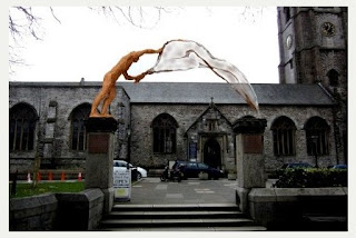
It was for an "an iconic work of art" to "adorn" the existing pillars between the main church of Plymouth, St. Andrew's, and Royal Parade. The budget was £20,000 and the deadline for submissions was the end of January 2015.
The brief asked artists to take note of St. Andrew being a fisherman, the presence of the Christian faith at St. Andrew's for more than 1,000 years, the "Resurgam" (I will rise again) sign that symbolises the church's restoration after World War II, and the special relationship between the church and city.
An article in the Plymouth Herald in May of this year named the winner as Rodney Munday with the proposal in the photos below:
Earlier this year I wrote a booklet listing some of my efforts to win public art commissions as part of a "Public Realm" assignment at College. (If you'd like a PDF of it please get in touch.)
Here's a copy of what I included about this project:
To cut a long story short, another student, Mim Brigham, suggested a joint project and this morphed into re-instating the railings either side of the pillars, as stainless steel screens of sea-weed with fish weaving their way through it, towards the pillars.
We then invited Noah Taylor, a metalwork specialist and resource manager at PCA, to join us and he suggested sweeping the screens up to the pillars and topping them with cast glass columns, drawing the eye towards the pillars and then upwards to heaven. The cast glass columns would be lit and would incorporate the word "Resurgam" as a negative space in their walls.
Although it was relatively simple to draw the sea-weed and fish screens in 2D, it was tough to visualise what they would look like when placed on top of the existing walls. Eventually, I made a scale model and used photographs of it in our joint submission.
Three of the 50-plus submissions for the project were shortlisted. Ours wasn't one of them.
Lessons
1) This was the first time I've worked with others to submit a joint proposal, and I found it very useful. Mim Brigham got the fish and sea-weed idea started by showing me a photo of some nice wrought iron work in a French cathedral. Noah Taylor proposed a way of bringing the attention back on to the pillars, and to the heavens, with his glass columns.
2) Making a model was a good idea, particularly as our project was hard to visualise in 2D. The model was relatively quick and inexpensive to make and was useful for trying out ideas as well as photographing for use in the submission.
3) It might have been sensible to abandon this project at the outset. "Adorning" the pillars just didn't seem like a good idea to me and I wasn't surprised about our rejection. On the other hand, I enjoy the whole process of entering these competitions and I learn from them even when I'm not successful.


No comments:
Post a Comment