Friday, 24 April 2015

Success breeds success?

A couple of "events" in the past week:
  • My submission for a competition for a public work of art on the Hoe was rejected.
  • I went to a talk by Marie Toseland, a conceptual artist, at Plymouth College of Art.
How are they related?

Well, they got me wondering about the proverb "nothing breeds success like success".

Marie seems to be riding a wave of success in getting residencies.  She recently completed a residency at the Tate St. Ives and she says that probably helped her get her latest one,  at the Royal College of Art.

I suspect that someone that's got credentials like this will beat me in a public art competition regardless of whether my idea is better than theirs.  It's less risky to pick someone that's accepted by the art establishment than picking someone like me, who's a relative outsider with not much of a track record.

I certainly felt like this on the Energy from Waste competition, where the selectors shortlisted mainly established artists even when they proposed ideas that didn't address the brief.  (See my previous whining on this topic.)  

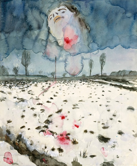
Marie works "across media".  She combines objects with writing and music, and I have to admit, I don't understand or like her work much   Here's a couple of  examples:

This one's called "Being and Nothingness"

This one's called "FP" and is something Marie found in a fetish market.  She has no idea what it's for.  The original was rubber and Marie made copies of it in other materials, such as ceramic, trying to make them look as though they were rubber so they intrigued people.  She admits she's not very good at making stuff.    She showed these with sort of discordant music and people reciting, er, I guess you'd call them lyrics or poetry.

In some of her other work, she explores hidden surfaces, for instance by getting a dentist to make a mould of the inside of her mouth.   She's also trying to sell her wisdom teeth, which have been extracted, likening it to prostitution - making money from your body.

I think the ideas are quite interesting but (sorry) I like art to look beautiful.

Friday, 27 March 2015

Make?

I paid another visit to the V&A  in early February and was bowled over by this exhibit:


The V&A description reads:
Steffen Dam (born 1961)
Jellyfish installation
2010
Steffen Dam replicates with remarkable accuracy the specimen jars found in natural history collections.  He is interested in the faults and irregularities that occur during the making process, and uses metallic oxides and foils to create three-dimensional shapes within solid glass forms. 
Denmark (Handrup, Ebeltoft)
Glass, silver foil and carbon layers, sculpted at the furnace, sand-cast into colourless glass, ground and fire polished.
 As you may be aware,  I've made my own cast-glass specimen jars, in which are the "ghosts" of deformed carrots... "they are no more - only the space they once occupied remains":


I thought I'd done a pretty good job on my specimen jars but they look really crude compared to the exquisite quality of Steffen Dam's work.

And that got me thinking.  

While I've been at Plymouth College of Art a number of people have told me that it takes 10,000 hours of practice to master a craft and for that reason, it's important to specialise in a single material.  I've treated the idea with a lot of scepticism.  But now I'm beginning to realise that achieving the standards of quality expected by the V&A and other famous institutions probably does take 10,000 hours.

But that hasn't made me think I should specialise in a single material.  Far from it!  

 If I practiced a craft for 40 hours a week, it would take me at least five years to rack up 10,000 hours, by which time I might be an old crock (or dead).  So I'd be better off continuing along the lines I've been pursuing with a lot of my efforts to win a public art commission -  developing a network of expert makers that can implement designs that I dream up.

I won't stop making stuff because I enjoy it, but I suspect I'll never achieve the quality of the likes of Steffen Dam.

Friday, 12 December 2014

Photography and Art

An interesting discussion is going on in the pages of The Guardian on this topic:

It was kicked off by Jonathan Jones having a rant, saying photography is a technology and can never be art:


The $6.5m canyon: it's the most expensive photograph ever – but it's like a hackneyed poster in a posh hotel


 In the comments, a reader points out Jones took the opposite view in an January 2013 article:


Photography is the art of our time


And in another Guardian article,  Sean O'Hagan pours scorn on Jones' views, calling them "quaint" among other things: 


Photography is art and always will be

 I enjoy Jones' rants although I don't agree with him about photography and art and I simply don't "get" some of the art that he thinks is marvellous.


Friday, 28 November 2014

Thomas Heatherwick

Last summer's competition for a sculpture for Derriford Hospital appears to have gone to sleep (see previous post) but one good thing to come out of it was a £20 book token for getting shortlisted.

I added 99p to the token and bought Thomas Heatherwick's "Making", a thumping great tome of a book listing a lot of his projects.

I like the layout!  Most of the projects are dealt with on a 2-page spread, which makes it nice and simple to read.  I've adopted the same idea for the research and design journal I'm doing for the "Public Realm" assignment we're currently doing at college.  In it, I've included a page about Heatherwick himself.

 One thing I'm not so keen on;  Heatherwick simply lists projects without saying whether or not they were actually made and I suspect that plenty of them weren't.

In some ways, Heatherwick represents the sort of creator that I would like to be, although I've probably left it a bit late in my own life to be saying that!

In any case, I like
  • The way he is willing to take on anything to do with design, whether it's a piece of art, a building, a bridge, a London bus or anything else.  
  • His approach of spending a lot of time and effort trying to get to the essence of the requirement before starting design work.  
  • His desire to push boundaries (and accept that this will sometimes result in failures).
  • The way he spends a lot of time and effort experimenting with stuff, often as a sort of intellectual exercise with no particular project in mind.
  • He works in any material
One big lesson to learn here is that some of his most successful projects are a sort of culmination of previous experiences.   Two examples:


 UK Pavilion at the World Expo, Shanghai 2010
This evolved over a period of more than a decade.  It started by looking at the way Play-doh was squashed through holes in toys depicting hair growing.  Heatherwick used the concept on other projects before creating this monster one.

Cauldron at the 2012 Olympic Games in London
Heatherwick used similar hydraulic power systems to create bridges over waterways that roll up to allow the passage of boats.  Interestingly, the design of the cauldron has been the subject of intellectual property wranglings - see this article in the Guardian.


Sunday, 23 November 2014

Anselm Kiefer

The Guardian's Jonathan Jones. who I've admired ever since he slagged off some of the world's foremost art theorists, recently wrote that Anselm Kiefer was "the most liberating painter since Jackson Pollock".  

 In another article,  Jones called Kiefer's exhibition at the Royal Academy "an exciting roller coaster ride of beauty, horror and history".

So I decided to go and see it while my wife did some Christmas shopping in Fortnum and Masons, on the other side of the street.

Well,  Kiefer's pictures certainly are dramatic.  Most of them are enormous - one is more than 12 ft high and 25 ft wide - and some of them make use of materials like lead, ash, cracked clay and crumbling earth.   

The engineer in me kept wondering how they managed to transport such huge objects that in some cases must be incredibly fragile and in other cases, incredibly heavy.  Apparently, the Royal Academy  allowed for an extended period to set up the exhibition.

The other question that bugs me is who would buy such enormous works of art?  You'd need to have an extraordinary scale home to accommodate them.

Kiefer, by the way, has two really extraordinary scale "studios".  

One of them is a 200 acre compound in the south of France.  When he moved there in 1992 he needed 70 trucks to move the contents of his studio.  Now, apparently, he'd need a lot more.  A review in the Guardian by Michael Prodger says: 


 "There are Kew Gardens-size greenhouses that are used as immense vitrines containing a 12-foot lead battleship washed up on a choppy sea of broken concrete or a full-scale lead aeroplane sprouting sunflowers. Elsewhere there is a cathedral-like barn with six house-size paintings in it and an underground temple of Karnak, where the columns were made by digging out the earth from around the foundations of the buildings above. There are tunnels and subterranean hospital wards, a lead-lined room full of water and a series of pavilions, each bigger than a squash court, with doors that open like an altarpiece triptych to reveal a single work inside. Metaphysics and megalomania are mixed on a daunting scale, and the effect is overwhelming."

Kiefer now spends most of his time in his other "studio" -   a 36,000 square meter former warehouse of a department store on the outskirts of Paris.

So what about Kiefer himself?    He was born in Germany at the end of World War II and is fixated on history, particularly the horrors of the Nazi era.  He managed to get into trouble in Germany by using the Nazi salute (which is illegal) to try and encourage Germans to address rather than suppress their recent past.  

He's also fascinated by German legends,  books, alchemy and the work of a poet, Paul Celan.

His paintings are incredibly powerful, partly because of their huge scale and partly because of the dramatic way in which they are "painted" - as noted, he "paints" with all sorts of odd materials.  I particularly liked Winter Landscape and a series of views inside a wooden hut, as in this picture.  I also liked his sheets of lead with diamonds embedded in them.

He also does lots of other non-painting stuff.

I liked his tanks of water containing rusting models of submarines, which were in the entrance courtyard of the Royal Academy.  As Jonathan Jones writes in his review,  they look like parodies of Damien Hirst's shark.

I really didn't "get" Kiefer's huge books.  You can't actually turn the pages because they're so massive  and so delicate - they make use of plaster.  And the images I could see didn't do anything for me.

Overall, I think I should have done some research before going to the exhibition, so I had a better idea what I was looking at.

UPDATE:  I hadn't realised that there was a TV documentary about Kiefer on BBC1 last Tuesday.  Here's a link to it on iPlayer - it's  only got a 4 week shelf life.

I came away from the documentary thinking Kiefer is quite extraordinary - the sort of artist I would like to be.  His interest in history is really about time and death and rebirth - how the atoms that make up everything in the world are constantly recycled.   One of the reasons he needs such big studios is that he never throws anything away - he says he's waiting until he finds a use for it.

Sunday, 2 November 2014

Tower Poppies

Here's an article by The Guardian's Jonathan Jones about the "Blood Swept Lands and Seas of Red" - the 888,246 ceramic poppies in the moat of the Tower of London:

http://www.theguardian.com/artanddesign/jonathanjonesblog/2014/oct/28/tower-of-london-poppies-ukip-remembrance-day?CMP=EMCARTEML6852

In a nutshell, Jones says he dislikes it because:
  •  It glorifies war - he suggests a moat full of barbed wire and bones would be more apt.
  • It pays homage to all of the British people that died without recognising the equivalent loss of life in other countries, notably Germany, France and Russia.  Jones calls it "a Ukip style memorial"
Jones says it's "humbling" to see the number of people viewing the poppies - an estimated 4 million by Remembrance Day on Nov 11, when the installation will start to be taken down.

He appears to think they would get more out of visiting the exhibition of Anselm Kiefer's work at the Royal Academy, which he clearly loves; he calls Keifer "the most liberating painter since Jackson Pollock."

Personally,  I think the poppy installation looks great.   I haven't seen it in real life but my wife and I have bought a poppy.   If I only had a brief time in London before Nov 11, I'd go and see the poppies, not Kiefer's exhibition.

I see Jones' points but this is all about paying respect, never forgetting the sacrifice made by all the British people that died in World War I.  And to me, the swathes of poppies provide a moving way of visualising the huge numbers of people that died.  I think visitors are able to grasp that this is just the British side and equivalent tragedies happened in other countries.

Jones' "humbling" comment speaks volumes.  I think art should arouse emotions and the poppy installation clearly does that among millions of people.  What makes their views less important than those of the art world elite?

UPDATE 1:  A follow-up article by Jonathan Jones, justifying his remarks in quite a justifiable way:
http://www.theguardian.com/commentisfree/2014/oct/31/world-war-one-poppies-memorial-cameron

UPDATE 2:  On Sunday 16th May I visited the Tower,  the "Women, Fashion, Power" exhibition at the Design Museum, the "Who are you" objects made by Grayson Perry in the National Portrait Gallery and Anselm Kiefer's exhibition at the Royal Academy.

I'll  write a separate post about Kiefer.

On the poppies, a lot of them had been removed, following Remembrance Day on November 11. All the same, the viewing areas were crowded with people.  It just goes to show how public art can have an enormous impact.


Having said that, I agree with Glen Carter, our glass lecturer, that the poppies streaming out of one of the Tower windows and forming a wave elsewhere - see photo above - look naff.  Perhaps more importantly I don't understand what they signify.


Thursday, 30 October 2014

Inspired by

For the sake of completeness I'm going to make a quick mention of my submissions to the V&A's "Inspired by" competition, both of which were failures:

Light Waves


 While I was doing an evening course in glass at Plymouth College of Art, I submitted this:


Entries have to be inspired by something in the Victoria and Albert Museum.

In this case, the starting point was Edmund de Waal's "Signs and Wonders" installation - objects that de Waal made in response to his favourite exhibits in the ceramics galleries which he arranged in a steel channel running beneath the dome above the museum's entrance.

I started out planning to make a small section of the channel in cast glass on to which I would place my own objects.   However, I couldn't see how to cast it as a single piece so I sliced up the channel into segments.   I then decided to make the top flange curl over like a breaking wave and abandon the idea of placing objects inside the channel.

After I'd made the wave segments I played around with how to present them and decided they needed to be placed over a hollow cast plinth and with very bright lights in it.   The very bright lights turned into 72 light emitting diodes on strips.

For more about this project, please click here.

In retrospect, I did a really poor job of grinding and polishing the glass on this project so that might be one reason why I got rejected.

Faces

This was a study of facial expressions and the emotions and attitudes they convey.  I produced it for  the "Artist-Designer-Maker" assignment at college:


This wasn't really inspired by an exhibit in the V&A but I pretended it evolved from "A Captive Audience?" by David Reekie.  It has similarities - identical figures in an array, one different from the rest etc.

For more about my Faces project, please click here.

I wasn't terribly happy with the outcome.  Also, I got a photography student to take the shots that I sent in to the competition and I think they could have been better.

Lessons

  • I should have looked at what won in previous years, to steer my choice of topic
  • Put a lot more thought into photography
  • Be more genuine about picking an exhibit as the starting point for a project