Thursday, 26 November 2015

Objectified


Another assignment for my Context of Practice course:

Watch "Objectified", a documentary in which a lot of leading designers talk about their work, and make some observations about it in the next session, scheduled for 3rd December.

I've just viewed it and as I won't be attending the 3rd December session, I'll make a few observations here.

Apparently, Objectified is the second of a trilogy of documentaries.  The first one was about the Helvetica typeface and the third is called "Urbanized" and looks at the growth of urban areas.

Regarding Objectified:

Here's a list of "Top 12 Quotes" from the video in a blog written by Build LLC, a Seattle-based firm of architects. 

The ones that struck me:

"Every object tells a story if you know how to read it,"  a famous quote by Henry Ford (cited by Andrew Blauvelt, design curator of the Walker Art Centre in the video).

It brings me back to a question I've asked myself before - should I try and make my work tell a story of my own making, or should I let my audience make up their own stories?

My experience suggests the latter.  For example:

  • The person that selected my "Ghosts" for an exhibition told me she'd picked it because of its references to the threat to global bio-diversity, a connection I'm still struggling to comprehend!
  • I only realised that I'd designed "Smitten" in the style of Beryl Cook when someone pointed it out to me, after I'd submitted the proposal.

"We now have a new generation of products where the form bears absolutely no relation to the function" - Alice Hawthorn, design editor of the International Herald Tribune.

I wonder whether this only applies to consumer electronics?

Actually, I think it all depends on what you're looking at in consumer electronics   - a point made by Bill Moggridge, the designer of the Grid Compass Computer, also cited in the video.  Namely, the design of consumer electronics doesn't stop at the surface, the hardware - it goes much deeper, into the software.

The reason that Apple's stuff is so successful isn't just because the outside surface looks minimalist and beautiful; it's also because the software is so well designed and intimately integrated with the hardware (which was probably top of Steve Job's manifesto).

I would say that form may not follow function visually in Apple products, but it does follow it from an "experience" point of view.

Thinking about it some more, I think there are other examples of form no longer following function.  There was a time when you could see the various components of a car engine, for instance - the spark plugs, the distributor, the carburettor,  and each one gave clues about what it was for and how it worked.  Nowadays, the whole engine just looks like a box;  the opportunity to fix things yourself has largely been with-held.

I like one of the final points that was made - that the means of making stuff is likely to shift into people's homes (or maybe the equivalent of libraries) in the future.  

I take this to mean that this will have a strong influence on design, and probably make designers more important in the future.


Vision for the Pillars

I've finally caught up with the results of another competition that I entered early this year in collaboration with Noah Taylor and Mim Brigham.

It was for an "an iconic work of art" to "adorn" the existing pillars between the main church of Plymouth, St. Andrew's, and Royal Parade. The budget was £20,000 and the deadline for submissions was the end of January 2015.

The brief asked artists to take note of St. Andrew being a fisherman, the presence of the Christian faith at St. Andrew's for more than 1,000 years, the "Resurgam" (I will rise again) sign that symbolises the church's restoration after World War II, and the special relationship between the church and city.

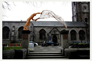
An article in the Plymouth Herald in May of this year named the winner as Rodney Munday with the proposal in the photos below:


Here's a link to Munday's website.   

I like the concept of his winning design; St. Andrew casting his net.  Personally, I would have preferred a more stylised implementation.

Earlier this year I wrote a booklet listing some of my efforts to win public art commissions  as part of a "Public Realm" assignment at College.  (If you'd like a PDF of it please get in touch.) 

Here's a copy of what I included about this project:

I never felt comfortable with this project. I thought the £20,000 would be better spent on landscaping around the pillars.

To cut a long story short, another student, Mim Brigham, suggested a joint project and this morphed into re-instating the railings either side of the pillars, as stainless steel screens of sea-weed with fish weaving their way through it, towards the pillars.

We then invited Noah Taylor, a metalwork specialist and resource manager at PCA, to join us and he suggested sweeping the screens up to the pillars and topping them with cast glass columns, drawing the eye towards the pillars and then upwards to heaven. The cast glass columns would be lit and would incorporate the word "Resurgam" as a negative space in their walls.

Although it was relatively simple to draw the sea-weed and fish screens in 2D, it was tough to visualise what they would look like when placed on top of the existing walls. Eventually, I made a scale model and used photographs of it in our joint submission.


 Three of the 50-plus submissions for the project were shortlisted. Ours wasn't one of them.
Lessons

1) This was the first time I've worked with others to submit a joint proposal, and I found it very useful. Mim Brigham got the fish and sea-weed idea started by showing me a photo of some nice wrought iron work in a French cathedral. Noah Taylor proposed a way of bringing the attention back on to the pillars, and to the heavens, with his glass columns.

2) Making a model was a good idea, particularly as our project was hard to visualise in 2D. The model was relatively quick and inexpensive to make and was useful for trying out ideas as well as photographing for use in the submission.

3) It might have been sensible to abandon this project at the outset. "Adorning" the pillars just didn't seem like a good idea to me and I wasn't surprised about our rejection. On the other hand, I enjoy the whole process of entering these competitions and I learn from them even when I'm not successful.


Sunday, 22 November 2015

Design Manifesto


This is a project on my Context of Practice course at Plymouth College of Art.    The brief says:
"You are asked to identify and define your own personal manifesto as a designer/maker and to articulate this through a poster/advert and a short interactive digital presentation. 
The project is intended to explore and externalise who you are as a designer/maker. what methods and principles you employ within your work, and most importantly what issues concern you within the context of your own practice."
So here goes on a manifesto

Who I am 

  • I'm not JUST a designer/maker.  I think my imagination, my ability to come up with novel ideas, is my strongest asset.  I'm an innovator/designer/maker!
  • I have an unusual combination of creative and engineering skills.  This sometimes steers my choice of projects.  It also means that I put a lot of thought into the way I make things.
  • I want to work in all materials.  I don't want to specialise
  • I like taking on challenging projects, preferably large scale ones

Issues

  • I want my work to amuse and intrigue everyone, not just people that already have an interest in art.
  • Although I'm doing a course in contemporary craft, I want to make art

Here's my first draft of a poster/advert:


My feeling is that the poster/advert needs to be simple so I've just focused on 2 messages - the text one saying I'm an innovator and the visual one, that I combine art and engineering.  

Do you think it works?

Here's an April 2015 article by  Harriet Baker called "10 game-changing art manifestos" on the Royal Academy website.  It ends with a Grayson Perry contribution, or rather his contribution on behalf of "Red Alan", a ceramic sculpture of Alan Measles, his teddy bear:


Friday, 13 November 2015

Teapots


I've started a parallel blog, solely focused on teapots, as my research project for the current Context of Practice course.

Here's a link to it: Peter's Teapots

Monday, 9 November 2015

Maths and Art

Another example of how maths can underpin art!

In this case, it's Dail Behennah, who gave a really good talk at Plymouth College of Art on 4th November.

Up until recently a lot of Dail's work has been 3D grids of willow sticks following some quite complicated geometries.   In her talk she called them "op art".   Here's an example:


"White Square" 41x 41 x 9cm white willow, silver plated pins

"My work is about line, light and shadow," says Dail's statement on her website.

 "I always try to bring to it a sense of calm, but not stillness," she adds.  I think she achieves this by rigorously following geometric patterns with a very high degree of precision.

It's also achieved by making the fastenings (silver plated pins in the above photo) a feature of her pieces, so, as she puts it, "the method of construction is open and honest." I like it!

One of the things that intrigued me with some of Dail's 3D grids is that they have inflexion points - positions where the view of them suddenly shifts as one plane comes into view and another one "hides itself" in the grid.

Dail designs her grids by hand so it must be almost impossible to visualise where these inflexion points might occur until she's made the piece.

This reminds me of something I made more than 40 years ago - block wave, a series of little wooden cubes cut so they create a row of twisted columns.  I drew attention to the twisting by painting the sides of the columns in different colours.  What I didn't realise until I'd made it was that it also created diagonal waves in each colour, across the work.

I've toyed with recreating this in glass, and Dail and I have exchanged a couple of emails about this idea (and other stuff).  She thinks the refraction of the glass could create some really interesting effects.  I think I'll take this forward when I've got time.

Back to maths and art.  In one of her emails, Dail says her maths "is instinctive not formal", which reminds me of M.C. Escher and his collaboration with Professor Sir Roger Penrose, an eminent mathematician.

Escher thought he had no mathematical ability but was able to express highly complex mathematical concepts in his woodcuts and lithographs according to a September 2015 programme on BBC TV.

UPDATE 16/Nov/2015:  I've now launched a project to make a glass version of block wave - here's a link to a page on my website about it.